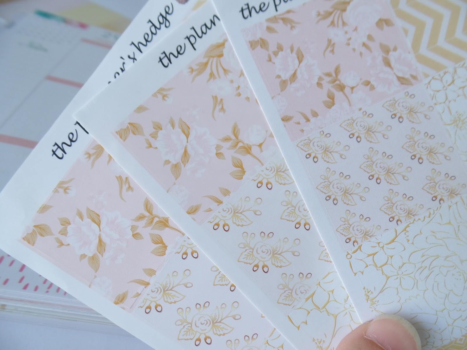
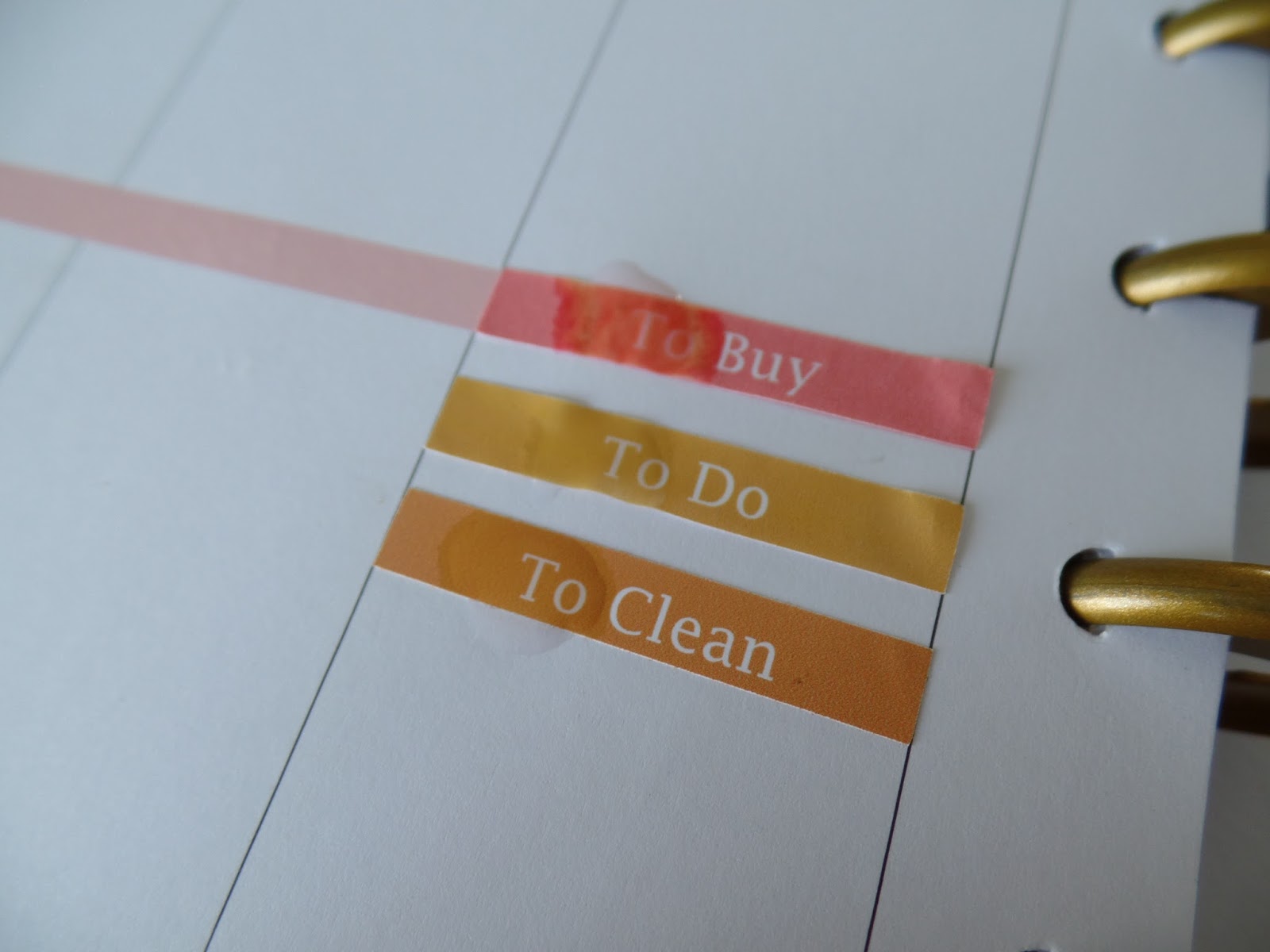
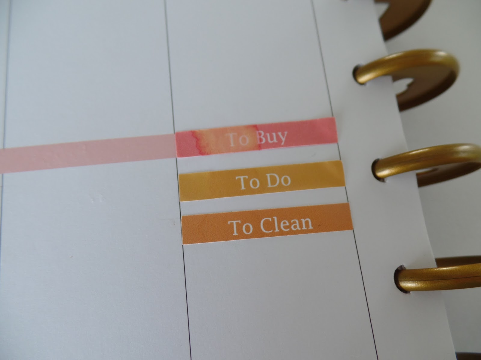
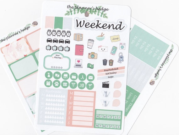
Showing posts with label Erin Condren. Show all posts

Tuesday, September 6, 2016

Plan With Me blog-style September Grapevine


One of these days I'm going to gain enough courage to hook up a camera and do this video style like the rest of the world... but until then, here's another edition of bad dining room window pics of my weekly planning.
I know you're excited.
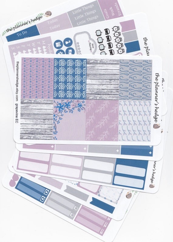
This week I'm using the September Grapevine full weekly kit.

September Grapevine Weekly Planner Kit

With one exception. I am not using a sampler sheet.
What???
Yup. No sampler.
Why???
Because I'm lazy.
Actually, it's because I happen to be missing the sampler sheet from this one and I also happen to have the remnants of other samplers that I've decided to pilfer instead, but it means I don't have the Weekend banner or a few other things... crazy, I know.
Plus it's already Tuesday morning and I'm just now getting around to planning the week. 
This Kansas girl likes to live on the edge.

Last week, I did a whole paper comparison post where I fell deeply, madly in love with a new found premium paper, and all week I couldn't help but run my fingers over my pages.
(This Kansas girl might also have a problem.)
And I am happy to report that I have finally received by big expensive order of that beautiful stuff to upgrade all the kits in my shop.
Hooray!

However, today I am not obsessing over my paper, I am using up the kit I already printed out on plain old regular matte sticker paper for personal use, so I will not spend my week stroking my pages. It is still quite pretty, though. I'm pretty picky when it comes to purple, but this one has some very agreeable shades, if I do say so myself.


This happens to be the only kit (I think) I have with the big wide washi band for the bottom. I usually design my kits with two narrower strips that you can stack or not stack at the bottom, the top, the middle, you see where I'm going with this. Because I like options. I often use the space at the bottom to extend my day, or write my shop updates, or keep track of design ideas...
I don't usually like covering that whole area with a big flat band of decor. But this week we have already decided I am throwing caution to the wind.
It's also going to be a different week for my usual work plans. My daughter is having surgery on Thursday, so I plan on the last four days of this week being anything to keep her happy and comfortable. 


This kit is also my only (I think) kit with solid washi instead of patterns for the 1.5 inch strips, and I was happy for that when I got down to the end and had varying heights of white space left beneath my Littles. I like the way the solid washi filled in without making it overwhelming pattern. I may have to make more like that.
What do you think of plain verses patterned washi strips?
Do you use the big bottom bands of washi or do you extend your days?
I'm curious.


Here are the stickers I have leftover so far. You know some of those will get used as the week goes on.
And here's the partially inked spread. 


Even though it's Tuesday already, I will go in and fill out my To Do list of the things I did yesterday and this morning. I like to be able to look back and see when things were done as much as seeing what needs to be done. It helps me know when to do them again and when I can get away with skipping a chore till next week.

How do you handle a late planning week? Do you retro plan, too, or just leave it blank?

Overall, I didn't miss the sampler sheet too much. I did pull some clocks and a laptop from leftovers of previous weeks, and I'll be digging through my stash for more as I fill in. 

If you have made it this far, leave me a comment to let me know I'm not alone. And you feel like stopping by my Etsy shop, use coupon code BLOGGER25 for 25% off any purchase of $20 or more! 


Tuesday, August 30, 2016

Plan With Me "Fall in Love"


Ahhh, fall is in the air...
well, it is a little bit first thing in the morning before the sun takes over and heats it up to 85*
I think it's the kids going back to school that's making me think fall, and the changing colors of the pages in my Erin Condren LifePlanner.
Did you think I was going to say leaves?
That doesn't happen much in Kansas, not the way it did when I lived in Vermont.
Does any of this have to do with a PWM?
It does when you take a look at the changing colors I was faced with this week...


Gold into purple smeared all over the place. It's moments like this that I wish I had gone with the neutral layout.
I had no choice but to hop on Etsy and buy some new colorful graphics and turn them into a colorful fall kit that would coordinate with all that watercolored ummm... stuff.
And here it is...


I called it "Fall in Love" because that's how I felt when I actually found some graphics that had all the colors I needed to make it through EC's next few months of watercolored challenges.

This kit is a four page Sampler Kit. That's what I call the kits that don't contain the full box ombres or washi sheets. I usually use the Full Weekly Kits because of my love for the ombres and washi, but this week I was re-formatting the Sampler Kits as well as trying out some amazing new sticker paper, so I wanted to test it all out and see how far this kit could go.


Without my normal ombre checklist boxes to stack with my headers, I turned the book sideways and placed the headers and checklist flags for my to do's. 
At this point I was already in love with my new vinyl like paper. 
The headers lifted up easily even though it is not labeled as repositionable. I was able to pull them up and straighten them out as many times as I needed and the little babies didn't fade or wrinkle or loose their shape. 
Love.


I tried something new in this set and made a two box spread with that fabulous car.
At this point I also wanted to kick myself for forgetting to calibrate my new Silhouette cutting machine! The cuts are off by just enough to show the white on the top of several of the stickers, but I decided to finish the spread and blog it anyway.  
Guess what I'll be doing today... ugh.


Despite the calibration fiasco, I really like the way they came together. With the lack of washi, and the adorableness of the two box car, I decided to layer that poor miscut weekend banner over the Today headers. I guess I can do without washi after all!
Maybe.


Last week I tried placing a half box at the bottom of each day to give me an extra little space for incidentals. 
At first, I didn't really like the look of it, but it became so useful as the week went on that I did it again this week. However, I didn't really like the look of that last line hanging out there at the bottom, and no washi sheet! 


Tape to the rescue.


And here's my favorite PWM trick I learned from Youtube... the old credit card washi cut. In case you haven't been around long, just keep an old store card in your washi stash. Line it up and tear the tape upward against it for clean straight edges.
One of those, can't believe I never thought of that, moments.


And there it is.


Just a few stickers left. I'm sure I will use most of them as the week goes on.
As it turns out, I really liked using the sampler kit. 
I liked not having any waste.
And the new paper?
LOVE
I just placed a huge order to upgrade my shop, and I will attempt to do a paper comparison post tomorrow.
You know by now that when I say tomorrow, it could likely be a week!
If you made it this far, thank you for visiting, and please leave a comment below so I know I'm not alone.


Comparing Sticker Papers

Ever wonder what the difference is between all the different sticker finish options?
If you've ever shopped on Etsy for planner stickers there's usually three main options.
Regular Matte
Glossy
Premium Matte or Matte Vinyl
Those are the three types I see most and the three I will be testing today.


First of all, each shop has their own sources for their paper, and believe me they are not revealing those sources, so the actual paper may vary quite a bit from shop to shop. 
I have even received an order from one shop that each sheet appeared to be printed on a different type of matte paper.
So this is not exactly a tell all of the secret world of sticker paper, sorry, but more of a general and badly photographed side by side test of three commonly used paper options to help get you started in selecting stickers for your planner. 
Personally, I started out with regular matte paper when I started buying stickers for my planner. They are usually the cheapest option, and I was worried that glossy would not take pen well and might stand out too much on my planner page... all that shine, ya know?
To be honest, the first time I actually tried glossy was for this comparison, and I admit I am surprised at how much I like them.
Can you say - Pretty!
Oh my gosh, pretty.
But despite that sleek, shiny appeal, they didn't hold up in other tests... making that oh so annoying decision between pretty and practical more annoying than ever.

So let's get to it.


Three identical sticker sets printed on different papers.
My first impression was how different the colors appeared. Less noticeable in my poor dining room window photos, I'm afraid.
In the photo above I have regular matte sticker paper on top, glossy in the middle, and premium on the bottom.
The colors on the regular were fine, quite beautiful in fact, but if your screen is better than mine, you might notice that they are a bit darker, a bit grayer, and not quite as vibrant. 
The colors on the glossy were also beautiful, but a bit paler. The darker golds were rich and gorgeous but the pale pink was not as visible.
The colors on the premium blew me away. I'm always hearing how much better glossy does on showing ink, so I was not expecting it to come out second best. The golds were soft and rich, the pale pink held its own, and the hues overall were vibrant and impressive. It looked like it had been printed on a different printer!


Here's another shot,
regular
glossy
premium
Now, the other big difference that you won't be able to tell no matter how I photograph is how these papers feel.
The regular you can imagine. It feels like paper. It's smooth and sturdier than your average printer paper, I shopped around a bit before I found a nice, clean, matte sticker paper that was affordable, but it is still just paper.
The glossy is slick and sturdy, a bit thinner than I expected, but has good body, if that makes sense.
The one I'm calling premium, is the one I couldn't stop touching! It has a soft buttery texture. Like a fine, smooth vinyl. If that makes any sense.

At this point, the three choices all have some differences, but so far it's more preference than performance. But we don't just buy these stickers to look at them...
ok, we sort of do. But to justify those purchases we actually use them. Usually.
So here's some performance tests...


Three headers. And just like before,
regular
glossy
premium
And now the color coding thing makes sense, right?

I stuck these headers into my classic Happy Planner today. But how often do you stick them down and they are just perfect so you leave them alone and move on?
Not often if your borderline psychotic like me.
No, I stick them down, then peel them up because they weren't quite straight, then peel them up because they still weren't quite straight, then peel them up because I changed my mind about where to put them, then peel them up... I think you get the picture.
And all the while I am cussing myself out on the inside because I know what all that peeling and sticking does to the overall end result. But. I. can't. stop.
Psychotic.


So here I peeled them up.
You can see that the regular pulled at the paper a bit.
The glossy pulled at the paper even more.
The premium didn't pull the paper up, but it did leave a little sticky glue behind.
None of them left the paper clean enough to go bare. I would have to place a sticker back down to cover the evidence from each of them.


Then I stuck them down in the next square. You can see the corners show the damage of lifting even though I was careful.
One more time...


Now the corners on the regular and glossy are really showing the damage, and the edges are pulling up a bit and looking stretched. The premium is looking pretty good. I ran my finger over the corner and the wrinkle smoothed out and stuck flat again. Very good.


Next I tried something that I always try to avoid, but I live a real life with real kids in a real house and real hands that I occasionally wash.
I can't tell you how many times my planner has suffered an accidental water attack, but this is the first time I did it on purpose.
One drop of water on each sticker.


The regular immediately did what it always does. It bleeds and fades.
The glossy didn't appear to bleed, but the actual paper sort of warped and got real fragile.
The premium got wet.


After a few seconds I dabbed them dry with a towel and let them sit to air dry for about an hour.


In the end, the regular looks pretty sad. The corners and top edge won't lay flat anymore from the re-positioning, and the ink ran a mess from the water.
The glossy shows some wrinkling and edge lifting from the re-positioning, and the water left behind a shadow like mark and wrinkly texture.
The premium impressed the heck out of me. It's laying flat. All that moving didn't seem to bother its edges at all, it's looking smooth and clean. If you look really closely you can just make out a shadow of a ring left behind where the water sat, slightly darker pigment. 
Seriously impressed.
So at this point, I have a clear front runner... but these stickers aren't just for looks.
Really they're not.
I have to write on them, too. 
Now, before you scroll down, remember that my handwriting is my nemesis.
I can't improve it. I've tried.
I give up.
Don't judge me.


For this I cut strips of each paper and placed them on a piece of regular paper.
It's all very scientific and precise.
And as usual we have 
regular on top
glossy in the middle
premium at the bottom


I wrote on each one with my favorite pens. Staedtler being permanent (and hard to spell), le pen being a felt tip, G2 gel pen being a gel pen, and I'm not going to explain ball point or pencil. You can google those if you need to.
Each time I wrote the word, I counted to three then dragged my finger across it to check for smearing.
I was cringing when it came to smear testing the glossy. I just knew it was going to smear like crazy and leave ink all over my fingers.
I was wrong.


There was only the slightest line of ink that ran at the bottom of the ball point pen and I'm pretty sure that was just one of those little ink balls that fuzz up and fall off of ball points now and then.
But I had been sure the gel pen would smear. Sure.
So I tried again with a darker gel pen ink color, and this time I did not count to three, just wrote and dragged my finger across...


And haha! I knew it would smear! Ok just a tiny little bit at the bottom of the letters, and guess what? The regular matte paper smeared a tiny bit, too. But the premium?

Crystal clear.
You can't argue with science, people.

Just in case you have outstanding observation skills and you're wondering why I didn't write Pencil on the glossy... I did. It's there, it just doesn't show up. 
So, if you're a pencil planner, I don't recommend glossy, and in fact, the pencil is the only one that didn't show extra beautiful on the premium paper either, it's visible, just not as dark.

All things said and done, how am I feeling about my sticker paper options?

Regular matte is a good economical choice.
It takes all inks and pencil well, but it hates water and doesn't agree with my re-positioning sticker perfection.

Glossy is pretty.
Oh so pretty.
But it shrivels at the sight of a wet hand and loses its stick and shape with re-positioning.

Premium matte with its vinyl like qualities is a strong durable choice. It is beautiful and stroke worthy (I don't mean that to sound nasty) with its soft buttery texture that takes ink and locks it in. It laughs in the face of my freshly washed hands and keeps its integrity through my OCD move-around habits, though it does leave a bit of glue behind when lifting that might be messy if you're not putting a sticker back on that spot.

In my opinion, the premium is the clear front runner and I have just placed a huge order to upgrade the stickers in my Etsy shop even though it's going to eat into my non-existent profits. I feel it is a better product over all and that's what I want to have represent me, just in case I start getting orders.

If you have made it this far, please leave a comment on what type of sticker paper you prefer. Have you found any other options out there? I'm curious... and I'd appreciate it!



Tuesday, August 23, 2016

Planner Stickers 101, stickers explained!

When I tell people that I have opened an Etsy shop, I get in general an interested smile, "Oh, how neat!"

When I tell them I am selling planner stickers, the smile freezes and fades as I see their brains working on a polite way to say, "What the hell is that?"

Well, relax folks, there's no need to stress the manners portion of your brain, because this post will tell you exactly what planner stickers are no matter how you phrase that question. 
I'll even show you some examples and some different ways of using them.
See how nice I can be?

Succulent Garden Sampler Kit

Planner stickers are, just that. Stickers that you put in your planner.
Why? You may ask...
Because it's fun.
It's a creative outlet.
Remember scrapbooking?
Well, it's like that, but more practical.
And I am nothing if not practical.
As long as the practical comes in pretty, coordinated colors, and neat straight lines.
And guess what? Planner stickers do.


I could end this post right there - planner stickers are stickers that you put in your planner - and some people logged off just now thinking well that's exactly what I thought, but maybe someone is still there wanting more. Maybe?

It can be confusing because the planner sticker world wasn't created with a team of people designating names for specific things like the people who decided what to call a ball point pen. Everyone knows what a ball point pen is because they did a really great job. But planner stickers were created by a mass of individuals, each in their own home, describing their products on their Etsy shops as what they call them.  
Functionals, weekly, monthly, reminders, icons... and any given shop may call them the opposite of another... When creating my shop I first had to research every other shop I could find just to figure out what to call some things, only to discover that one person's monthly was another person's weekly, etc. Ugh! No wonder I get so many blank what the hell is that smiles.
So for the duration of this blog, I'd just like to state that I use terms based on "in general, this is what I've found".
 Ok? Good.
In my shop a "full weekly kit" is a set of stickers intended to cover a weekly spread. Makes sense doesn't it?

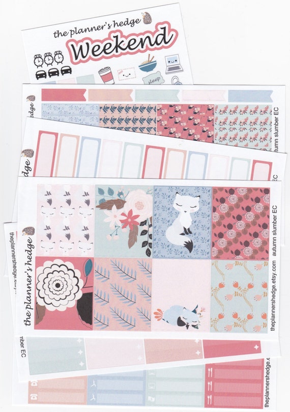
Autumn Slumber weekly planner stickers - a la cart
would cover this week in my planner

My weekly kits have 6 or 7 sheets including:

 
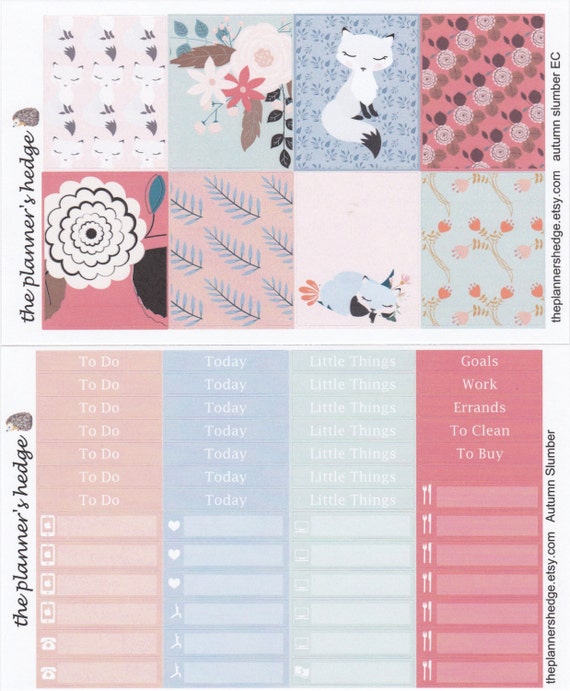
a sheet of decorative full boxes (top)
a sheet of headers and littles (bottom)

 Headers may seem more obvious, a handful of miscellaneous titles for specialty or sidebar use and 7 of each of the basic To Do, Today, and Little Things to place at the top of each daily section, but the littles themselves tend to change often from shop to shop, and quite honestly confused me at first.
In general they are all the little things you may want to remember or track that aren't really something on your to do list, like writing what dinners you have planned or noting that you watched episode 47 on your 230 episode series so you can pick up where you left off next time you have a day to binge. 
These also come in handy to look back at your week and see that you haven't posted on Instagram in a few days or taken your daily walk in over a week... but who's judging? 
It's just nice to know.
I tend to use them has things I have done or would like to do, like call my parents, rather than the tasks I have to do which go on my To Do lists.


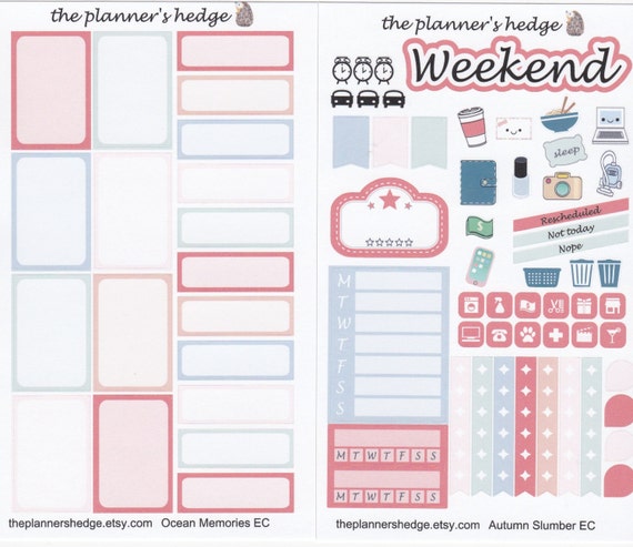
On the left, you have a sheet of half and quarter boxes.
The confusing part is that the half boxes are 1 inch tall while the quarter boxes are a half inch tall.
What?
This is because they are based off the Erin Condren Life Planner boxes which are 1.5 wide by 2 inches tall, therefor 1 inch is half the height and .5 is one quarter.
Now it makes sense. 
The sheet on the right is called a sampler sheet. It has a weekend banner, a bunch of fun little stickers for tracking chores and free time, clocks and cars for appointments or errands, checklist flags, regular flags, and a few boxes for the sidebar. The blue box is for a weekly schedule (work, cleaning, exercise) and the two red boxes are called habit trackers for things you want to try to do daily, like take a walk, drink your water, write a blog post... if you're good at things like that.
Then there are those two rows of little square icons. I recently made mine square (they are often round) because I wanted to be able to line them up in the ombre checklist boxes (below) without running into other lines and to layer them on the littles boxes when I might need a pet reminder instead of an exercise reminder, or whatever.  

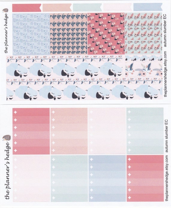
And last we have the washi sheet (top) 
and the ombre checklist boxes (bottom)

The washi sheet is one I have a love-hate relationship with. It's basically made up of long sticker strips that act like washi tape to cover up extra space at the bottom or top of your planner page, and several 1.5" box-width mini strips in varying heights to fill in or decorate here and there in your spread. I do like the long washi also known as the bottom washi... (yes, bottom washi is a hilarious term if you have an eleven year old boy around). It can really pull the whole page together and is often my favorite thing to design. But all those little box-width strips can be a real tricky balance of usually overwhelming pattern to my simple taste.
And for every time I have an odd little strip of space that I absolutely need a little piece of washi to fill in for that seamless no-white-space look... I have a half a sheet of unused pieces that really have no purpose. 


In this spread you can see the bottom washi of the adorable sleeping fox stacked with the floral strip at the bottom of the page, and I used some of the box-width washi layered behind the weekend banner to help it stand out without covering up the decorative full boxes above it.

The ombre checklist boxes, however, win my prize for favorite workhorse. In this spread, I used them as the top row, but they tend to move around the page week to week. I use them in my everyday, in the sidebar, I cut them in half when I need extra at the bottom or short lists for relaxing days... they are always a fully used sheet of stickers in my weekly planning.


And now I fully understand why most Plan With Me's are done as videos! 

If I haven't completely lost you, I will be showing more of this in a separate Plan With Me post tomorrow. 
I know you're excited.

Once again, thanks for sticking with me... get it? Sticking?
Ok, no more of that.
And if anyone out there actually read this far, please leave me a comment to let me know I'm not alone. I appreciate it.


Tuesday, August 16, 2016

The Happy Planner VS Erin Condren's Life Planner a side by side comparison...

In my last post I detailed the Happy Planner made by MAMBI and sold at craft stores like Michael's and Hobby Lobby. I mentioned how many virtues it had... 
the perfect size, the perfect layout, the ease of rearranging it for customization.
I really thought it was the only planner I would ever need.
But if you've ever spent a day in planner-land, you've heard of Erin Condren.
The gold standard of personal life planners in many circles.
Or as I like to call her the Queen Bee of Plannerland.
To be honest, I fell in love with her planners a couple years ago from a post by Jen at I Heart Organizing...
you know Jen, the Queen Bee of Organizing-Blogland...
She showed her EC Life Planner and I immediately linked over to buy one until I was stopped dead in my tracks from sticker shock.
girls
Photo courtesy of erincondren.com 

It appears these women are in the process of getting over their sticker-shock.
Yes, those babies are expensive... but aren't they beautiful???
Starting at $55 usd and ranging on up depending on which kind of cover, color of spine, and personal add-ons you choose, I believe it can hit close to three figures if not over when all said and done.
But that's just the beauty of it - you can customize it! 
Remember how much I like that?
Yeah.
You can choose your cover design, have your name printed on it, pick the color of the coil it's bound with, choose colorful or neutral schemes, add extra accessories... but of course with the Happy Planner you can also change the covers, the discs it's bound with, add extra accessories... and buy all those extra goodies with your craft store coupons, but they're not going to print your name or family photo on them for you, hmmm.

Now, I have to mention that the Erin Condren website is not always user-friendly. I have gotten stuck, turned around, and glitched a few times there while attempting to put together my perfect planner. And these hang-ups have always ended the same way... with me giving up and going home LifePlanner-less.

My bank account probably thanks me for that.

Until I stumbled upon one at Staples (yay Staples!) who has apparently contracted with Erin this year. They had a rack with a few different styles and accessories, not at all the wonderful customizable joy of "building your own" as the EC website puts it, but I never once glitched or got stuck while carrying it to the checkout.... except for maybe a brief detour in the Martha Stewart disc-bound aisle to snag a couple accessories for my Happy Planner... yep, I'm two-timing it planner-wise. Still not sure if that's a good idea, but anyway, here she is... my official Staples version of the Queen Bee...


 A simple date on a colorful cover, and classic "platinum" coil. It's not what I would have chosen if any of my LifePlanner building sessions had gone all the way through, but the cover is punched for the ability to remove and replace it. I can always purchase a custom choice for about $8 from the website or from various Etsy shops. However, I think it is pretty, and the planner was only $50 usd with no shipping. And I had a coupon. (yay coupons!)

Why so much less than the website? Because you don't get the lovely extras in the Staples version...
the direct purchased LifePlanners come with a clear plastic pouch that snaps in to hold your accessories, a snap-in ruler/bookmark, and some basic color coordinated stickers for marking out birthdays and appointments etc. 
*I am not able to find any of that mentioned on the website this morning as I write, so if they are no longer including these items someone please correct me*
But you're not here to hear about my personal internet failures... you want a side by side, 
so here go's...

Side by side (literally) they are very similar in size.

You can see how the Happy Planner cover and rings extend out a bit in both directions, though below you see with the pages themselves, the Erin Condren is a fraction wider, but still shorter. 


 Actual dimensions?
HP closed - 8 1/2 x 9 3/4 inches
EC closed - 8 1/4 x 9 1/4
HP page usable space - 6 1/2 x 9 1/4
EC page usable space - 6 5/8 x 8 3/4

That may have been taking it way too technical, but there you go.
now to the guts and glory...
The inside cover of the EC has a dry erase list page, the HP does not.

They both have a year at a glance... my HP had a glass of water spilled on it, I assure you it arrived perfectly smooth and pretty before my children came into the room.

After which the EC has this page which I believe is called a perpetual calendar to write in all the birthdays, anniversaries, and things that happen the same day each year.

My HP does not have one of those.

They both sport quotes throughout on the monthly divider page, and opposite...


The EC has a blank lined page for notes while the HP has designed an area for you to fill in upcoming events and current happenings like what you're listening to, watching, eating, etc. Memory planning style. 


The monthly spreads are nearly identical...
the EC boxes (lower in the following photo) are slightly wider but shorter than the HP (upper in the following photo)
And I have noticed throughout the Happy Planner selection at the store, some planners have more holidays and daylight savings times etc. printed in that mine does not have! My Erin Condren appears to have all of these as well as moon cycles printed in.


The monthly spreads are each followed by weekly spreads for that month and are similar at first glance...
Again Hp is upper and EC is lower.
They both have a side bar for notes. They both split the last few or first few days of a month into the week that has the majority. They both have vertical rectangular days with three sections, and this is where the differences begin...layouts

Wow their website pictures are so much nicer than my dining room window pics! 
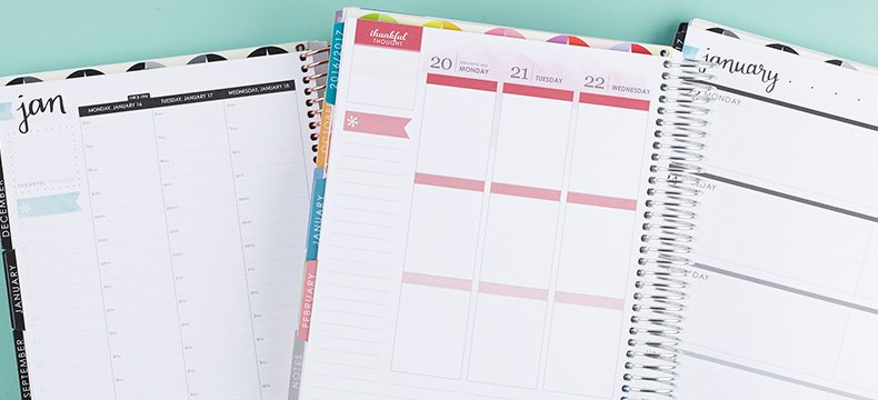
Anyway, Erin Condren offers you three different layout options, vertical, horizontal (far right), and hourly (far left).

But since I like comparing apples to apples, I'm sticking with my crappy dining room shots and the vertical layouts of each. 


HP has 1/4" blank headers for each daily section allowing you to write or sticker in your own headings, and 1.5 x 2.25" boxes for each of your daily parts.

EC also has 1/4" blank headers followed by 1.5 x 1.9" boxes and then followed by an extra daily notes area.
Still pretty similar, but the devil is in the details. 
If you happen to be a planner-sticker-person, and I am. Hence the Etsy Shop...
*If you do happen to be a planner-sticker-person check out the link to my shop
over there in the side bar >>>>>
You might notice that the EC has a little 1/8" space between the daily rows. 
Might seem insignificant at first, but look at what that does to the sticker layout...

EC above verses HP below

And once more...

EC above and HP below

Now, this is a personal choice, they don't call it a "personal" life planner for nothing... but that tiny 1/8" space between rows can be huge.
For me, it keeps the stickers in line, makes them easier to place in without bumping each other out of line when they get a tiny bit off center, and makes it all appear a bit cleaner in my opinion.
Of course, my terrible handwriting doesn't help things at all, but that's life. 

And did I mention all of those stickers are from ThePlannersHedge, my Etsy shop with a link right over there in the sidebar >>>>>>>>
(shameless plug!)

So there you go.

Happy Planner = $30 (and use a 40% off coupon at most craft stores)
Erin Condren LifePlanner = $50 + depending on your choices.
Similar size and layout.
EC = smaller boxes but extra lined writing space on bottom
HP = larger boxes without writing space at bottom
EC = space between daily columns
HP = adjacent daily columns
EC = wipe off notes on inside of covers and perpetual calendar pages
HP = no wipe off notes or perpetual calendar pages, though with the punch you can purchase with the Happy Planner and some basic computer skills you could easily add some new items that you make yourself! 
Both = removable + replaceable covers
Both = beautiful colorful schemes and thoughtful design

And that's about it. 

If you were able to get through the terrible dining room window photos and horrible handwriting skills displayed in them, I hope I've helped to to show the qualities of these two popular planner options. Leave me a comment if you have anything to add, or just to let me know I'm not alone!
I appreciate it.